Welcome to a new series, and something I’ve been looking forward to for a while: Level design workshop! For this series, I’ll be combining my usual level design analysis with a look at the creative process behind building a level from scratch. They’ll come in sets of two: the first will analyze a world or other group of levels from a game, and the second will apply common themes from that world to make the “next” level in it. With that idea in mind, I can think of no better place to start than the first world of Super Mario Bros.

I covered the first world as part of my First Impressions series in 2018, so I won’t spend time going over it all again. However, the main points I came away with are as follows:
- Levels provide multiple paths, however briefly
- Coins indicate where a player can go and give them reason to go there
- Power-ups and extra lives reward exploration
- Most levels have some semblance of an antepiece/setpiece structure
- Enforced by technical constraints, progression is entirely linear
With those concepts in mind, I got to work. After considering the themes and escalation of the first four levels, I decided to run with the concept of combining World 1-2 and World 1-3. As such, the final course would be underground, with some of the enemies and obstacles introduced there, but designed as a platforming obstacle course.
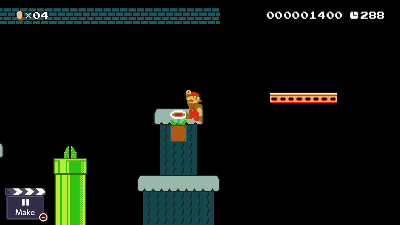
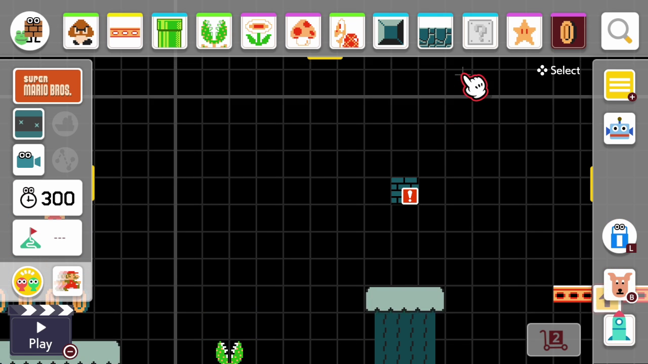
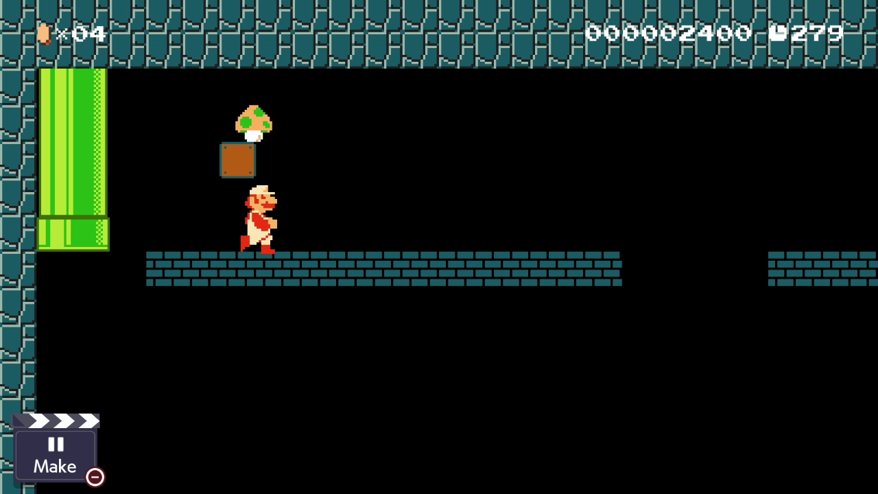
Having a concept didn’t automatically make the level spring to life, however. I spent a bit of time recreating the underground entrance pipe from Super Mario Bros., both to invoke the original and to get acquainted with the Super Mario Maker 2 interface. As I started on the underground portion, I decided on one of the core obstacles of the level: jumping to pipes with Piranha Plants in them.
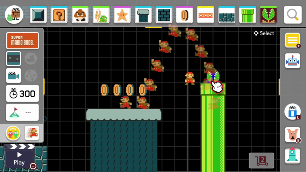
Piranha Plants were prominently featured in 1-2 after the entrance cutscene introduced the ability to enter pipes—players need to approach pipes with caution to reap possible rewards. I went back and forth on whether to put a Piranha Plant in the first pipe and decided to allow it. After the fact, I think I would have waited; pipes are small targets for platforming, and making them deadly half the time is a little bit beyond World 1 difficulty.
Once I decided on using the pipes, I used a moving platform to begin my response to the multiple paths seen in the levels I analyzed.
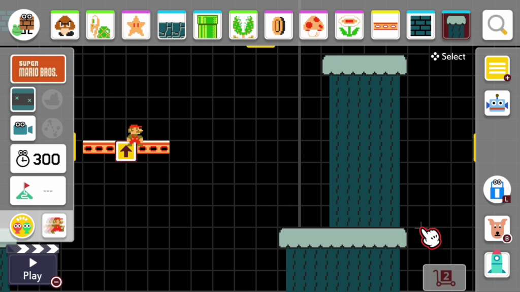
To clarify, no levels in World 1—or even the rest of the game, really—feature multiple paths with completely distinct areas depending on which way the player goes. The levels simply include multiple tiers of platforms so they can navigate the level from higher or lower altitude, which occasionally offer different rewards depending on the situation.

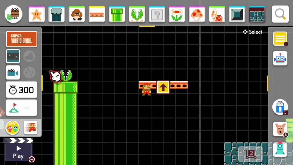
On my higher road, I included a Red Parakoopa, which flies up and down in a straight line directly where they need to jump to the next platform. The higher road is usually the more challenging path since gravity works directly against it, but adding the Koopa provided a more tangible risk.
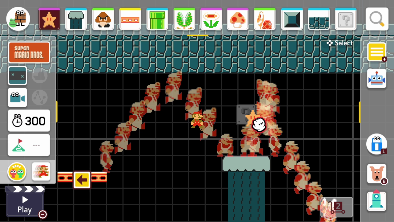
By this point, I had a suitable amount of basic ideas to work with. A level which uses a dozen enemies, obstacles, and concepts starts to lack cohesion, especially as short as the typical Super Mario Bros. level is. The core pillars of the level I made are Piranha Plant pipes, moving platforms, and Red Parakoopas—specifically jumping around all three of them. The natural conclusion was, so far as made sense for an early-game challenge, use them each a little bit more and combine them into a final test. I kept the upper path going with a couple of moving platforms, one of which largely bypasses the second pipe, provided a star at its conclusion, and set one more Parakoopa in the way before adding a jump from a third pipe to a moving platform to the end.
A few minutes of making the exit later, the level was complete in its first form. With a path from start to finish, the next step was testing, refining, and drawing it closer to its inspiration in concept. Right at first, I had issues with several of the power-ups I’d placed throughout the level. The first one in the underground segment appeared in the platform above due to the block’s location—not unreachable, but awkward-looking. I initially included a ceiling in reference to the ceilings in the original game’s underground levels, but reaching the 1-Up mushroom hidden in it required backtracking, a technical impossibility in the source material. Finally, the Star on the final platform of the upper path felt too obvious. In response, I moved the first power-up to the higher platform, swapped the Star block for a hidden one in the same location, and eliminated the rather purposeless ceiling altogether.
For my final correction points, I referenced a map of 1-3 to see what might have been missing. By my evaluation, I focused on the upper path enough that the lower path felt lacking in activity, so I broke up and moved platforms to give it a little more life. I added a few more coins and put a platform on the far side of the final pipe with another hidden block on it, to act as a safety net in case the jump proved too daunting.
Creating a Super Mario Bros. inspired level was an interesting task, and somewhat more difficult than I expected it to be. The nature of the game demands simplicity—a difficult task for a designer excited about their toolset. I certainly can’t claim to be on par with the designers behind a game that invented a genre, but the work they did is worth evaluating. Just as a painter would emulate a well-known artist’s style to learn, I intend to continue creating with the work of legendary game designers as a guide. I hope you’ll join me on the journey.
If you’re interested in watching the entire creation process for World 1-5, complete with me stumbling around an unfamiliar interface for a few minutes, I’ve embedded the livestream below.
